What is an Inverse Series?

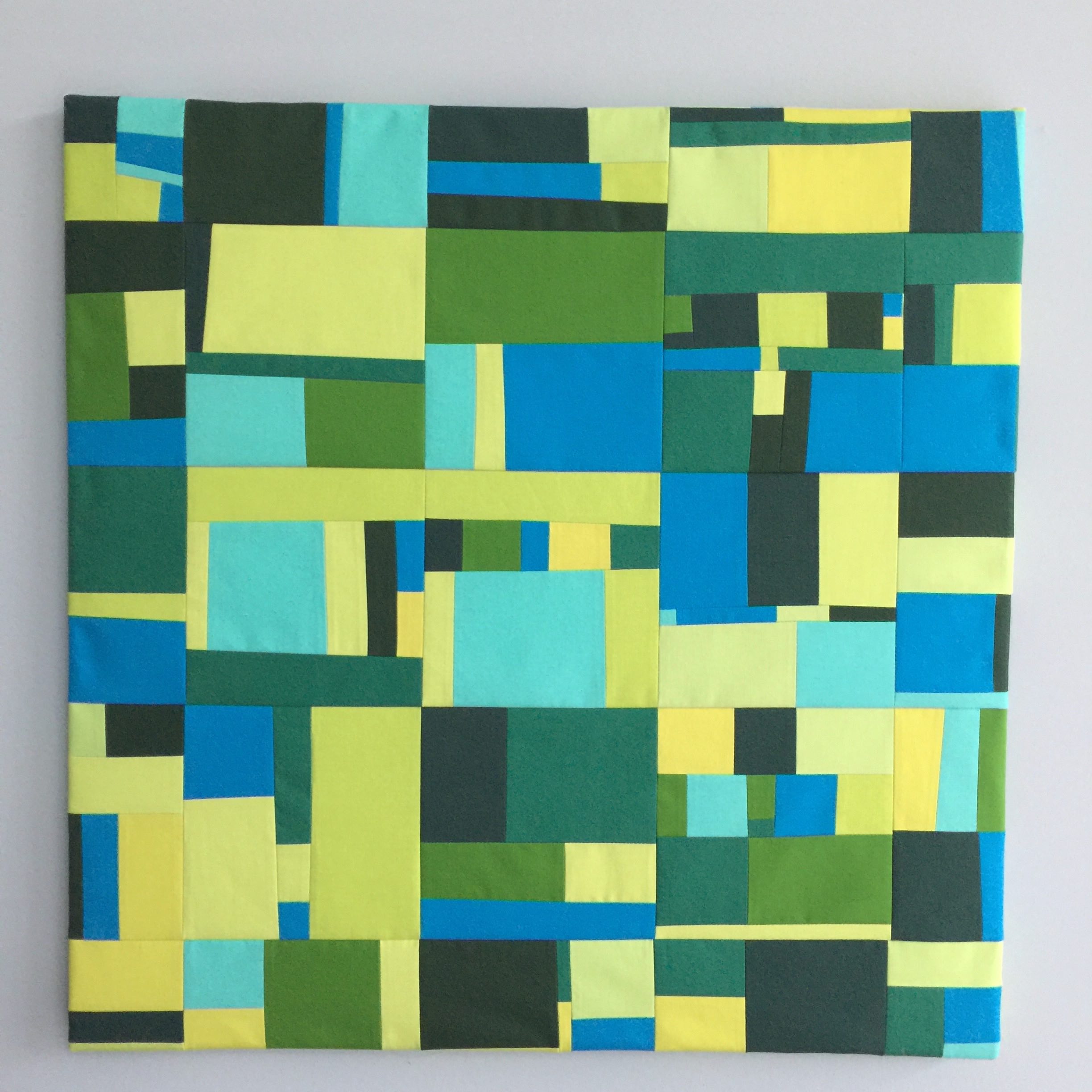
This past week in the studio,  I finished framing the Inverse series: Windows and Trees from my 100 day project of 2017. It has always been one of my more cerebral series. I will try to explain the idea behind this series below and hope that once you read my thoughts, it will be more clear why I used the title Inverse.

My original two ideas for this 100 day project series were vertical lines of fabric representing trees and a square representing a window, the two pieces on the right in the photo. Since I wanted to make four pieces in total for the series, I thought about the inverse of each design. For the original Trees, I used different colored strips of fabric within the trees inserted into a solid grey background fabric. Then for Inverse Trees, I decided to have cool tones of colorful strips of fabric as the background and just have a solid colored inserted grey line for the tree.

For the Window piece, I started with one gray square of varying sizes. The next step was to add warm colors in squares and rectangles around the square to look like crazy wallpaper around the window. The Inverse Windows has a grey solid background where you’re looking out the square window at sunset with warm colors.

I wrapped all four pieces around 24” stretched canvas frames. They are hung as a series. When they are all together, you can envision their Inverse concept easier than I can explain it in words.

The rolling to-do concept from a past Studio Notes article was super helpful last week because Monday and Friday are my usual studio days but I had made a doctor appointment on Monday and then went to a local quilt show at our Botanic Gardens with my Dad on Friday. These were important and I was so glad I could do them without worrying about missing studio time. So I rolled my studio time to Saturday afternoon. I powered through ironing all 4 pieces, lining up the frame accurately and stapling the pieces of fabric art to the back of the frame.

I had an experience that holds a valuable lesson for me. I wanted to use existing 30 inch sewn 25 day pieces and the largest standard size square frames are 24 inches. That means 6 inches of the 25 day pieces will not be visible and seemed “wasted” to me.  I knew I need 1.5 inches extra fabric on the edge to wrap around the canvas. So I was worried about 3 inches of wasted material. Some very interesting pieces of the daily squares are not seen on the back side of the frame. I had to let it go and move on. But lo and behold, I saw so much movement and more interest in these pieces because some of the design elements stop unfinished right at the edge and keeps you guessing. It makes the whole design appear like it is expanding rather than closed in like in a frame. You imagine the rest of the design. As a bonus, the interesting design on the edges of the frame look even better than I thought. I have included pictures of the edges of the art and how the design wraps around for you to see for yourself.

So sometimes circumstances that you think may not be ideal can take an unexpected turn and may be even more interesting than what you originally thought. I guess it helps to be open-minded.

If you are thinking about holiday gift giving, I offer gift certificates for items in my shop or custom EcoMemory art.

Let me know if you have any questions. Just click the CONTACT ME button below.
The Story Behind My Spring and Summer Artwork

This past week I was in a studio creating the last two of the Four Seasons series, Spring and Summer. The fun part of these pieces is all the colors I used to represent the flowers.

Four Seasons: Spring. October, 2018.

In spring in the Midwest, we have these flowers that bloom really early called spring ephemerals. They are delicate spring plants that come out before the trees have leaves. This way the sunlight gets to the ground and the plants pop up. But they are short lived and you have to time it just right to see them. One of my favorites are the gentians. They are the most beautiful pale lavender with the brightest green leaves. This is what I was going for with the Spring piece. 

Throughout the summer, our backyard prairie has a cycle of flowers that start with white flowering penstemon going to lavender bee balm and ending with a spectacular show of all the yellow rudbeckias and purple coneflowers. We have a few red cardinal flowers in our water garden so I added them in for a variety of colors in the Summer piece. 

Four Seasons: Summer. October, 2018.

Again I worked in the studio using my favorite process, pulling out the fabric and placing the pieces on my cutting board to fill out the design. Then I sewed the strips into blocks of fabric and then I sewed the blocks together to fill out the design. Lastly, I cut the square to size, stretch gently around the canvas and secure with a staple gun. 

The one interesting challenge for this design is I wanted the sky to all be the same size for each of the Four Seasons. This did not happen with the Spring piece so I needed to take all the staples out the back of the frame and realign it so I had equal skies for each piece. It was not an easy task and I will make sure to measure twice before stapling to the frame ever again. 

I’m considering having this series available in prints for the holiday season. They would be available in different sizes with a framed option as well. I will post more details on Instagram and in Studio Notes next week. I am debating what other items might be interesting: pillow covers or phone cases. Not sure yet. 

My project starting next week for the entire month of November is to complete all of my 25 Days series pieces from my Every Day Project and wrap them around canvases. I will use different size canvasses based on what would look good for the design. Wish me luck!

The Story Behind My Fall and Winter artwork

Four Seasons: Fall, October, 2018.

Last week, I was in the studio on Monday and Friday and it felt great. As always, I started with a little internet research for color palette ideas for my current Four Seasons series. There are a remarkable number of digital drawings of trees with different colors representing different seasons. I was surprised. Really, I just confirmed what I already had in mind.

So I started browsing through my fabric stash already washed, ironed, and prepped for past projects looking for colors for each season. My next step... I went through my scrap basket. I pulled out fabric in colors I found interesting and organized them into piles of similarly shaped pieces. I laid out my design on my cutting mat. I mentally calculated what section I was going to sew together first and then figured out the order in which to sew all the sections together. This is how I like to work in the studio.  It’s fun and as I said in last week’s Studio Notes, I want to keep it light and breezy. 

For my design, I usually decide on one element to hold the whole series together, be it a similar color palette or a similar design element. In this Four Seasons project, the constant is the sky in the upper third of the design. The sky is going to be different colors for different seasons. However, it will be the continuing theme that connects all of these pieces of the Four Seasons as a group. As for the design of the bottom 2/3 of the artwork, I’m imagining what our backyard prairie looks like in each season with the different colors of flowers, plants, and grasses. 

Four Seasons: Winter, October, 2018.

This past week I created the Fall and Winter pieces. I focused on the golds and greens that I love so much in the Fall piece. I added a bright blue sky for contrast between the brilliant blue and the fall colors. For the Winter, I decided on a gray sky and highlighted all the browns and grays of the prairie plant stems still standing throughout the winter. I added more white for fields of snow and one hint of red which represents how I love cardinal sightings in a field of snow.

I wrapped both of these pieces around a 10 in.² canvas. I played around with some new photography techniques and brought my artwork outside and took an image with the sky and prairie in the background. It gives a good sense of scale of the artwork and the color is really vibrant in the natural light. In addition, I added some process photos using the slide feature of Instagram. I showed how I lay out the fabric to design and then start sewing the sections together. 

And this week on Monday and Friday, I will be in the studio making Summer and Spring. This new productivity system I wrote about last week has helped keep me on track of focusing on my priorities and getting them done, as opposed to being overwhelmed by some of the minutia of my to-do list. You’re never too old to learn a new productivity tip. I am grateful because this system helps keep me in the studio with achievable goals. 

I’m still taking requests for custom EcoMemory holiday gifts.

Contact me by November 1, 2018 if you are interested or have any questions. 


What my clients have said about their custom EcoMemory...

I was so taken with our initial conversation and specific questions that transported me back to the location of the artwork. I felt the peace I felt as a child looking down on the colors of the sunfish and great depth of this beautiful lake.It was a magical experience and now  every morning I am transported to one of my happiest moment in childhood.  I love that the simplicity of color allows my thoughts to fill in the blanks.

-Pam from Seattle, Washington


Four Seasons and Productivity Update

Inspiration for my Four Seasons series. Clockwise starting with the upper left: Spring ephemeral gentians with bright green vegetation from a local Forest Preserve woods. Grasses turning brown in our backyard prairie. Purple bee balm in our prairie at the height of summer. Grey, brown and whites of winter across our creek.

Lately, I’ve been thinking about new series ideas to get me back into the studio on a regular basis. A few years ago, I created the Four Elements series; Fire, Water, Sky and Earth. My next series is going to be the Four Seasons. The size will be small, a 10 inch canvas for each season. The design sketches and color palettes are all ready. I’m heading into the studio this week with the spirit of play and adventure. The more I try to push being creative, the more I freeze up. So I’m going to keep it light and breezy.  Create just for the joy of creating. However, I needed a plan to get me going. Now I have one with this series idea. 

I am feeling particularly motivated to create since I completed the Lisa Congdon class on Creative Live, Work Flow, Time Management and Productivity for Creatives. I wrote about this class in my last post called Productivity Upgrade. The process described in this class is an exercise in getting rid of the feeling of overwhelm. Based on questions to my readers in the past years, I know this is the #1 problem people face in their creative lives. Too many creative projects in mind and too little time to do them. I highly recommend this course. I finished the class in one afternoon since I found the information so helpful and practical. 

My thinking has changed in more profound ways than I thought possible about completing tasks. When you load up your to-do list and schedule it with too many things to do, you can feel like a hamster running in a hamster wheel. It kind of takes all the joy out of being productive. A few days this month I woke up to over 100 things in my to-do list in my 2 Do app. Yuck. When you get clear on your entire workload, you get a visual snapshot when you put all your projects (large, medium and small) onto a spreadsheet called your workflow. It sounds geeky, but for visual people like me, being able to see your workload on one screen is empowering. Next step, you think about just your weekly priorities based on your current workflow. Then you transfer that to a rolling to-do list and you add in how much time it will take you to do that task. The steps sound simple but they set you up for feeling of completion. This is obviously a high level review. Lisa gives tips to make this process do-able. I am a convert. 

The times when I’m not working on my rolling to-do list, I am more relaxed and productive.  I’ve actually gotten more things done by doing this system. Long-term things that I’ve procrastinated like renewing my passport were completed once I added this as the main task for one day last week and I got it done. I have wanted to do a capsule wardrobe project for a year now. I put it down for Saturday and I got at least half of the project done. That sense of completing what you want to complete provides a momentum where you have the mental energy to do it.  This process really forces you to decide what are your priorities and what you can let go. I’m still working on that.

I sent you all an email last Sunday about opening up my schedule for custom EcoMemories. 

Contact me by November 1, 2018 if you are interested or have any questions. 


What my clients have said about their custom EcoMemory...

My favorite part of the custom EcoMemory process was being encouraged to really search the depth of my connections to specific places from childhood/young adulthood whether through memories visual, emotional or sensory (or all three!) I realized in the process how vitality important it is for me to return to those places on as regular a basis as possible.

The EcoMemory collaboration will result in a beautifully constructed and extremely personal fabric artwork encompassing your feelings and memories of place in abstract form. I’d also add how easy and communicative Kathleen is to work with.... that she really listens to her clients and that her dealings in all ways are done in an extremely professional manner.

-Jackie from Kalamazoo, Michigan

Productivity Upgrade

I usually do not pay attention to ads in Instagram. But when I saw an ad for a Creative Live class taught by Lisa Congdon on productivity, I was interested.  The Creative Live format is so good and I have taken several of their classes online over the years. Lisa Congdon is an artist whose work I have always loved as well as her very business-like approach to art and organizing yourself. I read her book Art, Inc a few years ago. She has written honestly about overwhelm and the need for boundaries in any creative business in a blog post entitled, On Self-Employment, Workaholism, and Getting My Life Back.

The course in Creative Live is Workflow, Time Management and Productivity for Creatives .

In the introduction of the class, Lisa starts with a vision of ease and control. You wake up knowing what to do every day and have the time and energy to do it.

What a vision. I am hooked. I want that.

Color inspiration from hiking this weekend on Poppy’s Rock In Wisconsin which is a hill of exposed glaciated smooth fine -grain pink granite.

I'm just starting this class today. In the past, I have tried different approaches to time and space organization for years and have written about it many times in these Studio Notes. I have improved dramatically in my productivity. However, I feel I need a reboot. My weekly schedule has changed with a part time job so my creative time is cut in half. I want to be more productive in the time I have available instead of feeling always behind. As anyone who creates knows, feeling that you are behind schedule, or rushed, shuts off the creativity pipeline in your thinking. This Lisa Congdon course is my antidote to this feeling of “never enough time.”

The topics she covers ranges from, How to create an effective workflow, Working with a rolling to-do list, and Time blocking.

I am particularly interested in the Time blocking. I used this strategy when I first started my daily squares back in 2015. Then I got a little too sloppy with just fitting in the studio time whenever. I have blocked out the studio time on my calendar but it has not been consistent. Other things seem to crowd out the studio time.  I am hoping to learn some new strategies to right the productivity ship. I will update my progress in future Studio Notes.

As I wrote last week, I am opening up my studio schedule this Fall for the Holiday gift giving season. If you want to give the gift of a commissioned EcoMemory to a loved one this Holiday, let me know.

Here is what one of my client’s said about their EcoMemory artwork.

I loved reliving my memory when I described it to you. I loved how your questions prompted me to think about the feel of the sand on my toes, the Dominican heat and the smells and sounds around me. I also really enjoyed seeing your sketch and the fabric choices. It made me so very excited about what was to come and about my brother seeing the final piece.

I would tell my friend that Kathleen's work is wonderfully colorful and joyful. That it's a perfect gift for someone you love and know well but it's also a beautiful memento for yourself. That it has a way of transporting you to your favorite place while allowing for room to dream and modify your memory as you wish. When I see mine I think of different moments in time, each fabric square tells a different story about the place and the elements in it. I simply can't stop looking at it! :)

-Natalie from Connecticut

Space is limited so contact me by November 1, 2018 to schedule a time. Click HERE for the Contact Me form.

If you want to learn more about the process, click HERE. I’d be happy to answer any questions you have about the process. Just let me know.


View from the Edge of the Water

I delivered a commissioned EcoMemory to a client last week. I find the “big reveal” very satisfying. By the time I have presented the art to the client, we’ve already talked for an hour about their favorite place in nature. We’ve already discussed the written report I wrote which outlines my ideas for the color palette and design of their EcoMemory based on our interview. I have a very clear idea in my head for the design and the fabric colors and what it will look like. However, even if the client has read the report with a line drawing of the design and an image of the stack of fabric I will use, it’s very hard for people to imagine what the final piece will look like. For that reason, it is always a joy to watch them unwrap their EcoMemory or to hear about it from client’s I needed to mail the EcoMemory to.

In particular, this was a special EcoMemory because the client is a good friend of the family. Her daughter commissioned me to create this EcoMemory for her mom’s birthday. One thing I’ve learned from this process is asking a simple question “What is your favorite place in nature?” is really not a simple question. In this case, we went on a journey of my client’s life and how being near a body of water was essential to her story.

It was the peace and quiet she would find on the edge of the water, be it from a creek from her childhood, an ocean in Maine or one of the Great Lakes in the Midwest. This concept helped me free my idea of an EcoMemory as being just one location. At first, during our conversation when she said it wasn’t just one place, I struggled to think how I can create an image of multiple places. By the end of the hour, I knew that it was just a calming presence of water, in general. I had the idea and now I could run with it.

I researched the different places that she told me about on Google images and used these photos to give me ideas for colors and design. In this piece, Edge of the Water, in the image below, the three design anchors are the white lighthouse with the black top on the left, the green for the tall pine trees on the right and the pewter color of the waters edge with a section of Duponi silk which represents my client on the waters edge looking out over the water at sunset with a sailboat in the distance.

Edge of the Water, 2018.

After I presented her the Edge of the Water, we ate some lobster rolls as a reminder of Maine. We found a place for her to put the artwork and hung it up immediately. My hope for each EcoMemory is that when people look at their artwork, they feel all the emotions we discussed in our initial interview; be the place one of solace, or a nostalgic time in childhood, or a vacation spent with family.

Every single EcoMemory I have created has been different, not just in the obvious way by location, but also in the way the artwork makes the client feel. But for the most part, it is always about the peace and calm we feel when we are in nature.

I am opening up my studio schedule this Fall for the Holiday gift giving season. If you want to give the gift of a commissioned EcoMemory to a loved one this Holiday, let me know.

Space is limited so contact me by November 1, 2018 to schedule a time. Click HERE for the Contact Me form.

If you want to learn more about the process, click HERE. I’d be happy to answer any questions you have about the process. Just let me know.

Looking In All the Right Places

I have rededicated myself to writing morning pages every morning. For those not familiar with this technique from Julia Cameron in her book, The Artists’s Way, it is a writing exercise done first thing in the morning where you just keep writing 750 words by hand, the old fashioned way. Every day. I have made some modifications to her process. I fill one page of my composition notebook daily while drinking my morning coffee. Sometimes I do stop writing but get right back to writing when I notice this. This writing practice has a way of bringing up your deep thoughts. Somehow it is easier to write them out and then you realize that is exactly what you were thinking in a kind of hazy inarticulate way. I started this morning pages practice in 2012. Sometimes I am more consistent than others. I use the same Deconstruction composition notebooks in various funky designs and special colorful gel pens. It is the kind of habit that spills over into your every day life and effects many other things. It can be a direct line to self awareness. It helps me take action and not wallow in negative thoughts.

I know how powerful this practice can be, but I was astounded when I found myself outside writing in my decomposition book and realized I started seeing color combinations and design ideas right in front of me as I was staring out at our prairie garden. Some of you sharp readers are like, “hey, you were supposed to be writing, not daydreaming.” Yes, correct. Sometimes I alternate between the two activities. 

Looking In All the Right Places. Sunset down the road last week. Variegated leaves for a great design idea. Brilliant green moss color. Prairie color combo of lavender asters and mustard goldenrod.

This is exactly what I said I had missed most taking a summer sabbatical in my Studio Notes last week in the article, Just Start. Here I was thinking about color and design, looking for inspiration. I obviously was looking in all the right places. I was outside on our kitchen patio on a windy first day of fall. I was letting myself daydream and be open. Simple stuff. An idea or intention to think more creatively, some time where I had no pressures, and a beautiful spot in nature. Perfect combination. I gave myself the time to be open and the space to be inspired.

I did something I have rarely done. I posted the photos of the color combination and design ideas on Instagram. As a rule, I have only posted my art on Instagram. It just felt so natural and I was giddy to be seeing inspiration all around me again.

If you feel a little down in the dumps creatively, try giving yourself the time and space that you find the most inspiring. And then keep doing that. This works if you are a knitter, a quilter, a musician, a dancer, a poet, a woodcarver, etc.  You get the idea. It can work for everybody.

Just Start

Have you ever had an experience where you need to take your own advice? For two years I’ve written about creativity and how to make time for creativity on a regular basis. The advice I give most often is to Just Start. I have found myself in need of this advice after my summer sabbatical. It was the right thing to focus on my family over this summer. However, I missed the regular creativity. After a while in the beginning of the summer, I stopped searching for new ideas for designs and color palette. I stopped thinking of ideas to share in these Studio Notes. These good creative habits were temporarily “out for lunch.” I need to get them back. 

I’m someone who needs the structure of getting into the studio at a certain time and working on a certain project. So I told myself I would start just hanging out my studio for an hour every day last week. Something always came up. Granted, some were family emergencies which I needed to help with. But I’m having a hard time being consistent. The ironic thing is I enjoyed being in the studio so much last week.

Playtime in the studio, September 2018

Playtime in the studio, September 2018

When I was in the studio last week, I worked on a commission piece as well as an idea for a long-term project. So while it’s easy to say Just Start, it can be difficult to execute. We all have competing demands: jobs, children, extended family obligations, grocery store runs, errands and administrative things that just need to happen. I realized I need the structure of studio time on a regular basis to give my creativity equal weight with other competing demands. More importantly, what I really want is that habit of creativity back, that mindset of always looking for ideas to create art or to write about.  So the important thing is not just the time in the studio, but how it changes your thinking by always looking for new ideas to try.

So tomorrow I’m going to be in the studio again and start exercising that creative habit. 

Coral Reef Updates

Coral Reefs, 2017.  Available for purchase. CLICK photo above to learn more.

Coral Reefs, 2017.  Available for purchase. CLICK photo above to learn more.

My last big series with a nature theme is my Coral Reefs piece. These last three series I wrote about inspired me to offer custom EcoMemory art for people to remind them of their favorite places in nature.  It is basically what I was creating for myself with the Clouds, Forest, and Coral Reef series.

Part of my studio time this Fall will be dedicated to creating custom EcoMemory art for the holiday season. As one of my customers said, a work of art that is designed specifically for you is a very personal gift for yourself or for a loved one. Click HERE to learn more about my EcoMemory process of interviewing the client, writing an EcoMemory report explaining the design and colors, and the final artworks.

My summer sabbatical is ending and I am getting back into the studio again. So look for updates next week.  

Here is the original article.  

Last week, I started a  new series called Coral Reef, Lizard island. The inspiration for this idea is a documentary on Netflix called Chasing Coral.


Collage of images taken by our daughter at Lizard Island, 2014. Turtles and cuttlefish are her favorites in the second row down.

The documentary tagline from their website is... "Divers, scientists and photographers around the world mount an epic underwater campaign to document the disappearance of coral reefs."

I highly recommend this documentary. You can see a trailer in the link above. It is powerful. You see people who love and study coral reefs documenting the effects of warmer ocean temperatures. 

This documentary hits close to home. The last part of the documentary was filmed at Lizard Island, a research station on the Great Barrier Reef off of Australia. Our daughter spent 10 days on Lizard Island in 2014, the year before the coral bleaching events that occurred in just 30 days and are documented in this film. Watching her see the damage done to a place that she loves was heart breaking. A significant portion of the coral died, along with the ecosystem that relies on it.

When I decided to write about this series, I asked our daughter, "Why is Lizard Island one of your favorite places?" 

She said,

"Lizard Island is one of my favorite places because it is an isolated island that is very pristine. There are not a lot of humans who live on the island since the only people allowed are researchers that really care for the island. You can tell in how they take care of the island that it is a labor of love. Also it is a remarkable place for seeing unique coral, sea turtles and cuttlefish (two of her favorite animals in the world). There is a huge biodiversity of life. The island is a little oasis in the coral reef that isn’t plagued by eco tourism and is remote so you feel like you are exploring an ancient sea because there are no people. And, of course, it is also beautiful, very colorful."

How does it make you feel when you think of Lizard Island?

"I feel grateful for being able to see such a beautiful place. I also feel Inspired by the diversity of animals and plants that are there."

Coral Reef, Lizard Island series. Day 227 of 2017. October 3, 2017. One of 25 six-inch squares sewn together for the final piece.

Coral Reef, Lizard Island series. Day 227 of 2017. October 3, 2017. One of 25 six-inch squares sewn together for the final piece.

So I wanted to do an ecosystem series and I knew after watching this documentary that coral reefs would be the first one. I researched the organization involving the Chasing Coral team, The Ocean Agency. I love how they describe themselves and their mission.

"The Ocean Agency (formerly known as Underwater Earth) is a not-for-profit organization founded in 2010 by a group of ex-advertising execs and creatives. 

We believe, above all else, great communication is key to finding solutions. We've allowed the ocean to lose it's magic - we've allowed it to become irrelevant. That needs to change and it needs to change quickly.

People can be inspired to act - we're just missing that all important word... inspired. "

Then I found out they have an initiative called 50 Reefs where they are focusing on how to solve the problem. 

"The 50 Reefs initiative aims to rapidly bolster existing coral reef conservation efforts globally by catalyzing new targeted action and investment in key geographies. It will identify and protect coral reefs that are least vulnerable to climate change, that also have the greatest capacity to repopulate other reefs over time."

Now, I was fired up to help connect people to the coral reefs through my art. Art can be a powerful vehicle to tap into people's emotions and inspire them. I do this to honor our daughter and all the people who are inspired by our oceans and all of its inhabitants.

I went about planning this series in my usual way, deciding the color palette and the design parameters. My color palette is based off of images at Lizard Island. I have 3 different shades of blue for the water on the top row of the final piece, tan for the sand on the bottom row with various shades of purple, coral, orange  and yellow to depict the coral itself. To be true to the images, I held up my fabric to the images to match as closely as possible.

My design for this series is different in that I am providing a scene for a real place. Usually my work is more on the abstract side but I wanted to give the feeling of the water above and sand below which really struck me in all the images. The coral reef part in the middle will be vertical strips of the different corals colors. When seen all together, it will be like one large healthy coral reef full of diversity. 

I want this series to be a tribute to all the people who care about our oceans and the work that 50 Reefs is doing to protect our oceans and coral reefs.


Coral reef near Lizard island images from The Ocean Agency

Imagine Standing In a Forest Looking Up Updates

Forest, 2017.  Available for purchase. CLICK photo above to learn more.

Forest, 2017.  Available for purchase. CLICK photo above to learn more.

As I wrote about last week, this article is all about the Forest series.  It is still one of my favorites. I felt like I was able to capture the mood I was going for. Sometimes that can be an elusive thing, chasing an idea and making it visible in fabric sewn together.

Here is is the original article.

My current series the Forest has been getting some attention in my Instagram account. Even people who have followed me for years said there was something special about this series with the multiple greens and the varying compositions. When I was trying to describe it to one of the commenters the thought came to me I really imagine standing in the forest looking up at the trees with dappled light all around and seeing the blue sky peeking through. I captured the emotion that I use to create the Forest series into words. Sometimes it is hard for me to capture that essence into words and I am practicing doing it. This time I felt like I succeeded. I shared this with one of the commenters and they got it.

The Forest using fabric. Day 207 of 2017.

The Forest using fabric. Day 207 of 2017.

Art evokes an emotion. Then what does this Forest series say? The calm greens and blues remind you of the peace you feel in nature as you are standing in the forest yourself.

Now people may say I had no idea it was about the woods since I never read the title of the series. This is the beauty of color. The colors themselves do the calming. You don't even need to have the image of the nature scene in your mind.

This series has been so fun to work in. But I say that about whatever series I am working on. In this case, I do feel that special connection having spent time in forests myself. That knowledge of time spent observing nature comes out in this series.

The Forest using acrylic paint

The Forest using acrylic paint

Last week I was in a bit of a creative slump. As I was talking to one of my artist friends about this she suggested I just go and play around with acrylic paint and the palette knife like I wrote about in Studio Notes last week. I shared an incident last week that a piece of art I made in high school with a palette knife and acrylic paint is similar in composition to what I make to this day. Back then, I thought I couldn't be an artist because I could not draw so I never picked up a palette knife again until Wednesday. At first I hesitated and thought it would be a distraction. It's not my medium and it might muddy my creative waters. But then I said why not. Be adventurous. It sounded kind of fun to do. I found an old paint set that I bought a few years ago thinking it might help my creativity flow by trying a different medium. I guess this seemed to be the time. The odd thing is that the set actually had a palette knife. So I just started by setting up the supplies. But I didn't know what to paint.  I realized I had the Forest series color palette and design parameters from my current series. This would be a variation reinterpreted in paint instead of fabric. This experience got me thinking.

If art is about emotion, the medium of that art is just the support system.

The emotion comes from the art no matter the medium. This goes a long way to quelling the issue is fabric art like other art like oil painting or watercolors. Art is art if it is made of fabric or paint or colored pencils. Art is about the emotion evoked in the viewer.